
Hi there,
I want to make a table that could slide horizontally by flip on mobile screen.
my site URL:
https://xn–eckipmx7dxa4b6ithka3ib2312sfk9d.site/
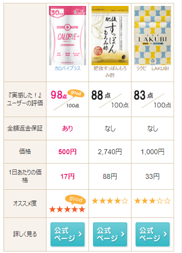
This is my current table (or you can see the screenshot below). The table has 4 columns now, and I want 8 columns, without changing the table height.
I added the following code to style.css.
  .hikakuhyo-body { padding: 0 15px;
  width: 100%;
  overflow: auto;
}
The test page:
http://demo.xn–eckipmx7dxa4b6ithka3ib2312sfk9d.site/demosite/
However, it didn’t work. The columns just squeeze in the screen-size and can’t scroll. The column width also shortened. The simple table that I added underneath worked. Thus something in hikakuhyo-body class may be causing the error, but I can’t find it and got stuck. If you could possible help me with this, I would really appreciate it!!
Css code for the test simple table underneath:
.table_container{
  width: 100%;
  overflow: auto;
  -webkit-overflow-scrolling: touch;
}
The new style.css
.hikakuhyo { margin-bottom: 40px;}

.hikakuhyo h2 { text-align: center;}


@media screen and (min-width:768px){

  .hikakuhyo-body {
background-image: url(images/hikakuhyo_top_pc_2.jpg);
background-repeat: no-repeat;
height: 486px;
  }

  .hikakuhyo-body2 {
background-image: url(images/hikakuhyo_ranking_top_pc_2.jpg);
background-repeat: no-repeat;
height: 501px;
  }

}

@media screen and (max-width:767px){

  .hikakuhyo { margin-bottom: 20px;}

  .hikakuhyo h2 {
padding: 0 15px;
margin: 0 auto 10px auto;
  }

  .hikakuhyo h2 img { max-width: 291px;}

  .hikakuhyo-body { padding: 0 10px;}
  .hikakuhyo-body2 { padding: 0 10px;}

}

@media screen and (min-width:768px){

  .hikakuhyo-bottom {
background-image: url(images/hikakuhyo_bottom_pc.png);
background-repeat: no-repeat;
height: 69px;
  }

  .hikakuhyo-body ul,
  .hikakuhyo-bottom ul {
  display: table;
  table-layout: fixed;
  width: 650px;
  margin: 0 0 0 130px;
  padding: 6px 0 0 0;
  }
  .hikakuhyo-body2 ul,
  .hikakuhyo-bottom ul {
  display: table;
  table-layout: fixed;
  width: 650px;
  margin: 0 0 0 130px;
  padding: 6px 0 0 0;
  }

  body.page-id-74 .hikakuhyo-body ul { padding: 28px 0 0 0;}

  .hikakuhyo-body ul li,
  .hikakuhyo-bottom ul li {
display: table-cell;
text-align: center;
  }
  .hikakuhyo-body2 ul { padding: 28px 0 0 0;}

  .hikakuhyo-body2 ul li,
  .hikakuhyo-bottom ul li {
display: table-cell;
text-align: center;
  }

  .hikakuhyo-body ul li img,
  .hikakuhyo-bottom ul li img { width: 120px;}
  .hikakuhyo-body2 ul li img,
  .hikakuhyo-bottom ul li img { width: 120px;}


}


@media screen and (max-width:767px){

  .hikakuhyo-body { padding: 0 15px;
  width: 100%;
  overflow: auto;
  -webkit-overflow-scrolling: touch;
 }

  .hikakuhyo-body table {
  border-left: 1px solid #d5c4a9;
  border-top: 1px solid #d5c4a9;
  }

  .hikakuhyo-body th,
  .hikakuhyo-body td {
  border-right: 1px solid #d5c4a9;
  border-bottom: 1px solid #d5c4a9;
  text-align: center;
  padding: 10px 5px;
  width: 25%;
  }

  .hikakuhyo-body th {
  font-size: 1.2rem;
  line-height: 1.4;
  background-color: #f8f2ec;
  }

  .hikakuhyo-body th.product-img {
  font-size: 1.0rem;
  background-color: #fff;
  color: #a68349;
  vertical-align: top;
  padding: 5px;
  }

  .hikakuhyo-body th.product-img img {
  display: block;
  margin: 0 auto;
  }

  .hikakuhyo-body th.product-img img.ranking-icon {
  width: 28px;
  margin-bottom: 4px;
  }

  .hikakuhyo-body td.btn-more { padding: 8px 5px 5px 5px;}

  .hikakuhyo-body td strong { color: #ed1e79; /* ピンク */ }

  .hikakuhyo-body td small { font-size: 1.0rem;}

}
My index.php
<div class="hikakuhyo">
<?php if (is_mobile()) : // Show on mobile ?>
<div class="hikakuhyo-body">
<table>
<tr>
<th> </th>
<th class="product-img"><a><img src="<?php echo esc_url( get_template_directory_uri() ); ?>/images/calobyeplus_product_s.png" alt="カロバイプラス">カロバイプラス</a></th>
<th class="product-img"><a><img src="<?php echo esc_url( get_template_directory_uri() ); ?>/images/suppon_product_s.png" alt="肥後すっぽんもろみ酢">肥後すっぽんもろみ酢</a></th>
<th class="product-img"><a><img src="<?php echo esc_url( get_template_directory_uri() ); ?>/images/lakubi_product_s.png" alt="ラクビ LAKUBI">ラクビ LAKUBI</a></th>
<th class="product-img"><a><img src="<?php echo esc_url( get_template_directory_uri() ); ?>/images/lakubi_product_s.png" alt="ラクビ LAKUBI">ラクビ LAKUBI</a></th>
<th class="product-img"><a><img src="<?php echo esc_url( get_template_directory_uri() ); ?>/images/lakubi_product_s.png" alt="ラクビ LAKUBI">ラクビ LAKUBI</a></th>
<th class="product-img"><a><img src="<?php echo esc_url( get_template_directory_uri() ); ?>/images/lakubi_product_s.png" alt="ラクビ LAKUBI">ラクビ LAKUBI</a></th>
</tr>
<tr>
<th>『実感した!』ユーザーの評価</th>
<td><img src="<?php echo esc_url( get_template_directory_uri() ); ?>/images/hikakuhyo_otona_point.png" alt="98点" class="point"></td>
<td><img src="<?php echo esc_url( get_template_directory_uri() ); ?>/images/hikakuhyo_surattokiriri_point.png" alt="92点" class="point"></td>
<td><img src="<?php echo esc_url( get_template_directory_uri() ); ?>/images/hikakuhyo_kokorokaradaanshinyousan_point.png" alt="90点" class="point"></td>
<td><img src="<?php echo esc_url( get_template_directory_uri() ); ?>/images/hikakuhyo_kokorokaradaanshinyousan_point.png" alt="90点" class="point"></td>
<td><img src="<?php echo esc_url( get_template_directory_uri() ); ?>/images/hikakuhyo_kokorokaradaanshinyousan_point.png" alt="90点" class="point"></td>
<td><img src="<?php echo esc_url( get_template_directory_uri() ); ?>/images/hikakuhyo_kokorokaradaanshinyousan_point.png" alt="90点" class="point"></td>
</tr>
I’m not well-versed with coding stuff, so the simpler the code, the better. Thank you!!