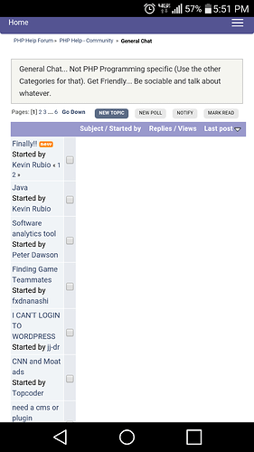
I see the site is now mobile-friendly (responsive). Much easier to use on my phone. Thanks to whoever did it.
[member=46186]Kevin Rubio[/member] I’m making one more change, hopefully tonight when I get time. I’m going to replace the menu with a better one so it doesn’t take up as much space on top.
Funny you mention that, that was the one thing I noticed that could have been improved.
It’s a little better.
Integrating a bootstrap menu, wrecked havic on the original CSS. Some of the sizing is a little off, but it’s bearable. If you notice anything crazy let me know.
Nice work! It is definitely coming along!
Very nice. Single best Improvement you could have done for this site making it responsive.
[member=71845]JimL[/member] I noticed that too last night before I went to bed…
Landscape looks pretty good, I’ll take a look and see what I can do.
Same thing on my phone…
If you all can pinpoint the CSS spot causing that issue let me know, also [member=46186]Kevin Rubio[/member] was it that way prior to me switching out the menu?
It happened after the menu switch
Just got back from lunch, it’s fixed.
Let me know, if you see any other issues.
It’s not fixed.
Can you send me a screen shot, and what phone are you using?
Look again, I use an iphone 5s and it’s perfect on it.
I wonder if your browser is caching the old style sheet?
Try this…
From any home screen, tap Apps > Chrome.
Tap the Menu icon, then tap Settings > Advanced > Privacy > CLEAR BROWSING DATA.
Select the Cache check box, then tap Ok.
Working now, without clearing the cache. I have those auto set, because of the development statues. Speaking of, really need to work on some mobile development stuff again.
[member=46186]Kevin Rubio[/member] Is it working for you?
All good!


